Case studyCase study
Riverside
Outdoor · Identidade VisualOutdoor · Visual Identity
O desafioThe challenge
Traduzir em marca a sensação de conquista de quem escala uma montanha, acampa com os amigos e sente a natureza na pele.Turning into a brand the sense of achievement of climbing a mountain, camping with friends and feeling nature first-hand.
A soluçãoThe solution
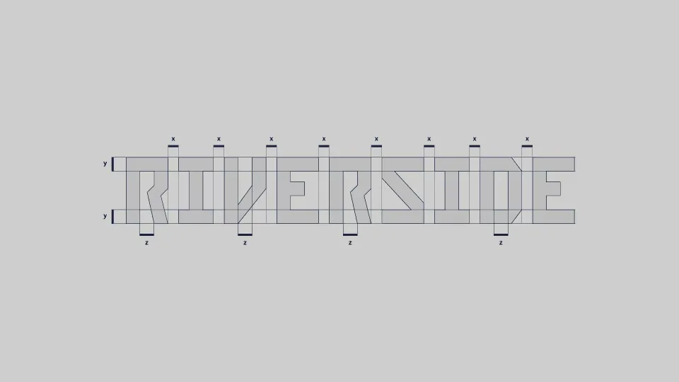
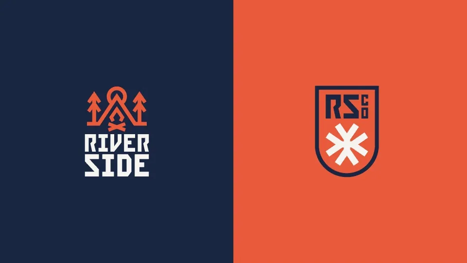
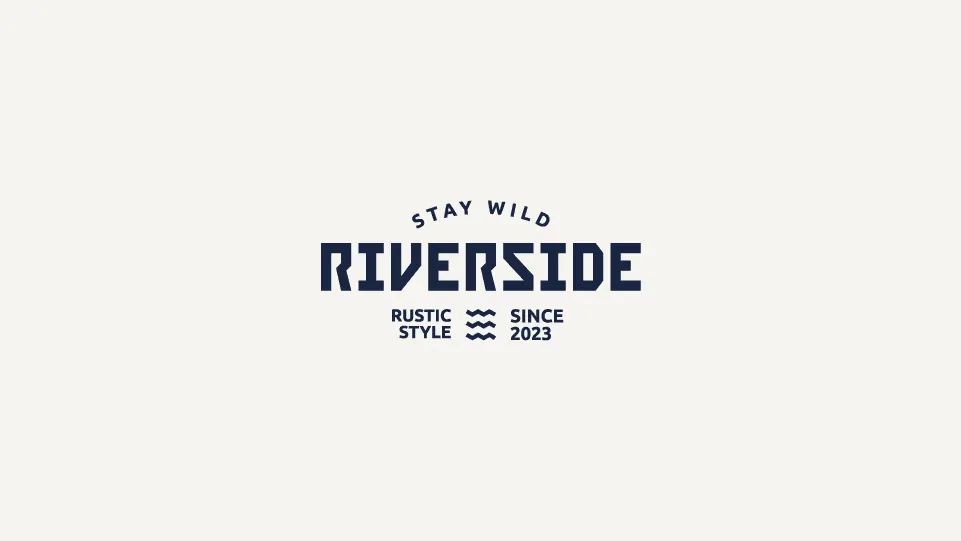
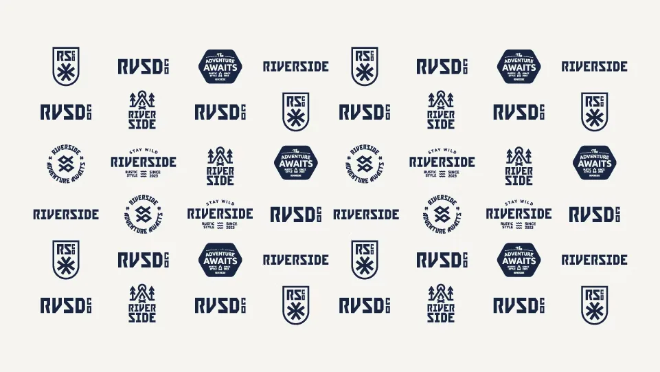
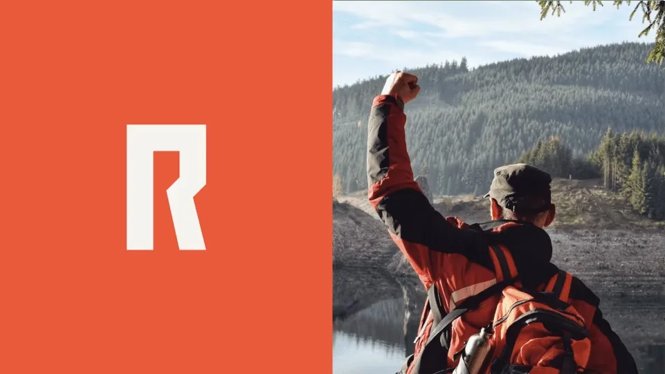
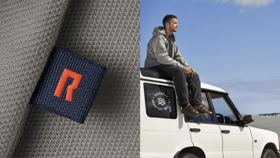
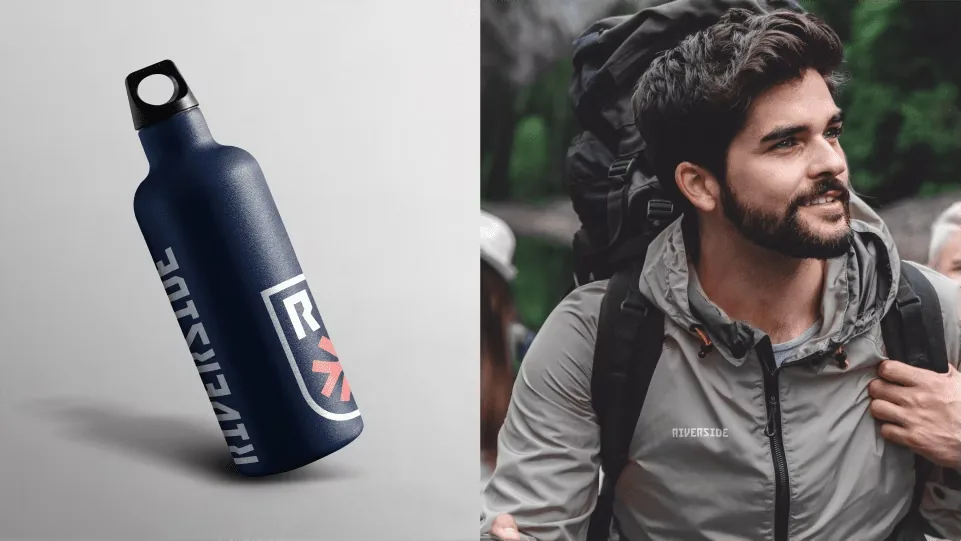
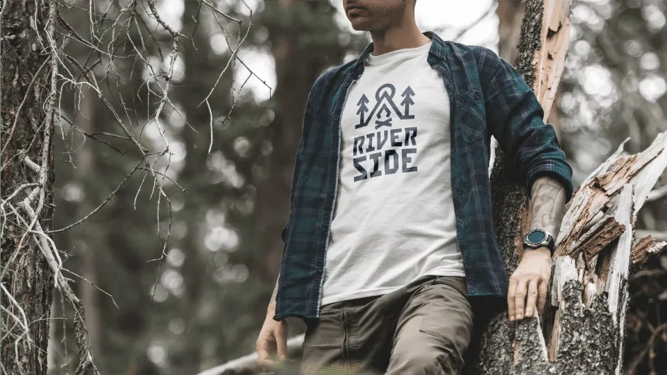
A letra R, inicial do nome, carrega em seus traços a silhueta de um punho cerrado, o gesto da comemoração. As formas do logotipo geram os demais elementos do sistema visual.The letter R, the initial of the name, carries in its strokes the silhouette of a clenched fist, the gesture of celebration. The logotype’s shapes generate the rest of the visual system.
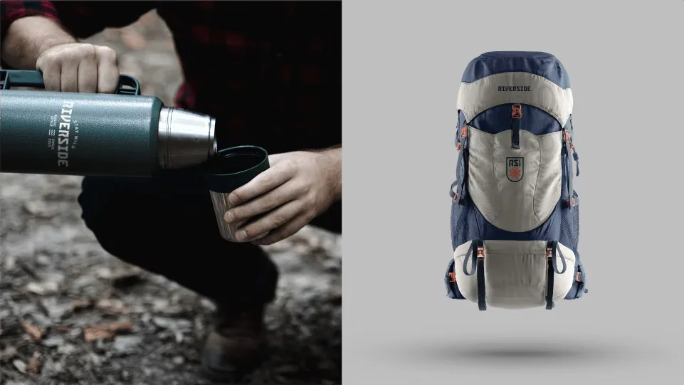
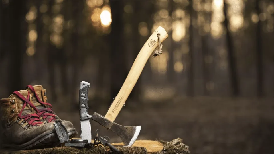
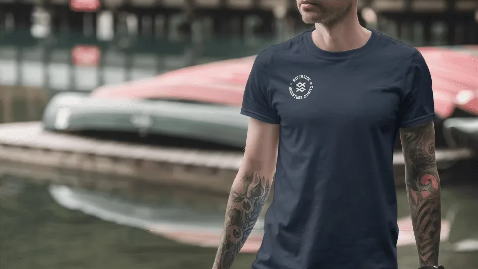
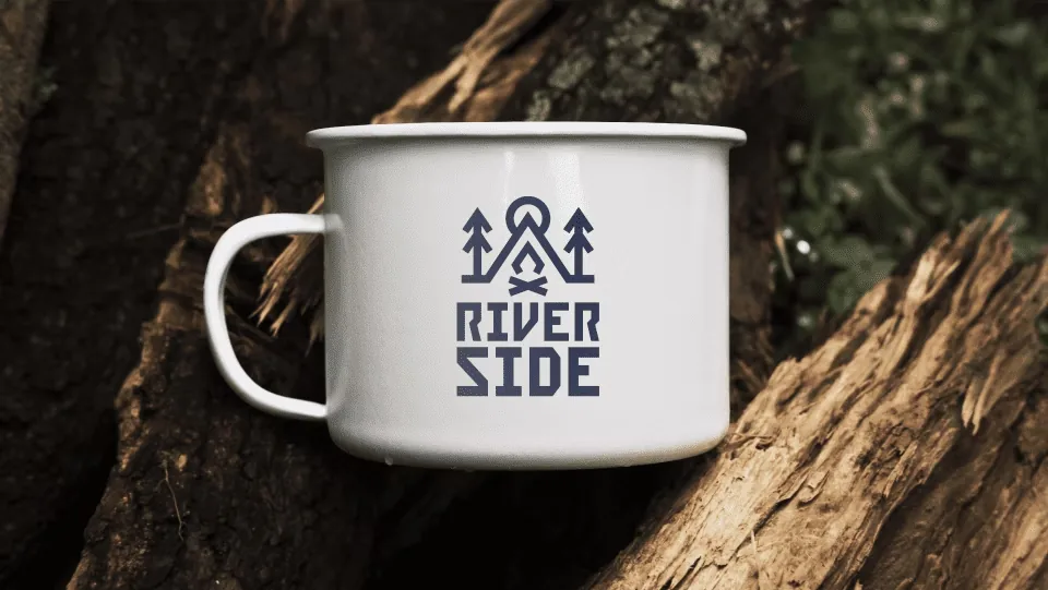
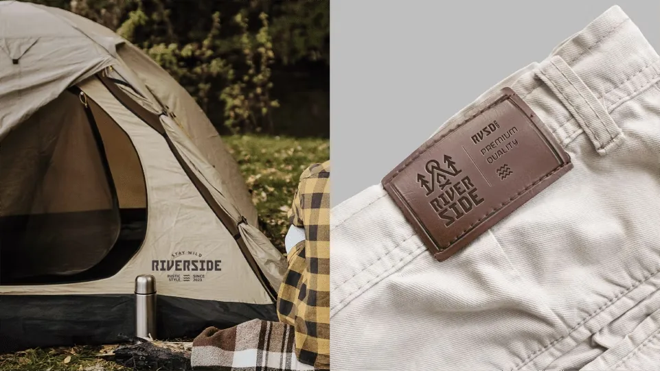
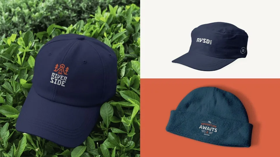
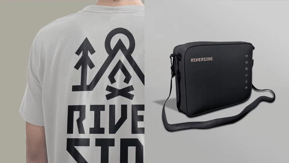
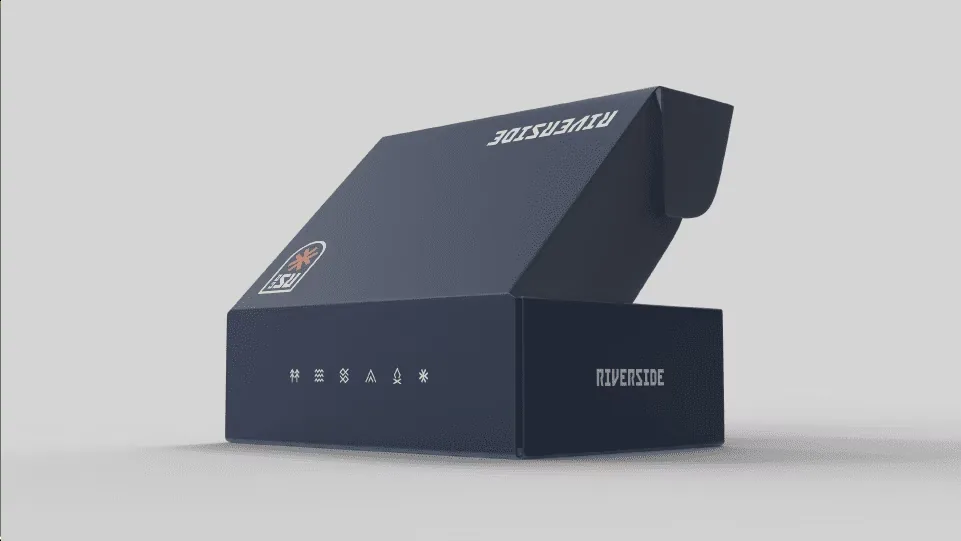
Escopo do projetoProject scope
MarcaBrandlogotipo, símbolo e versõeslogotype, symbol and versions
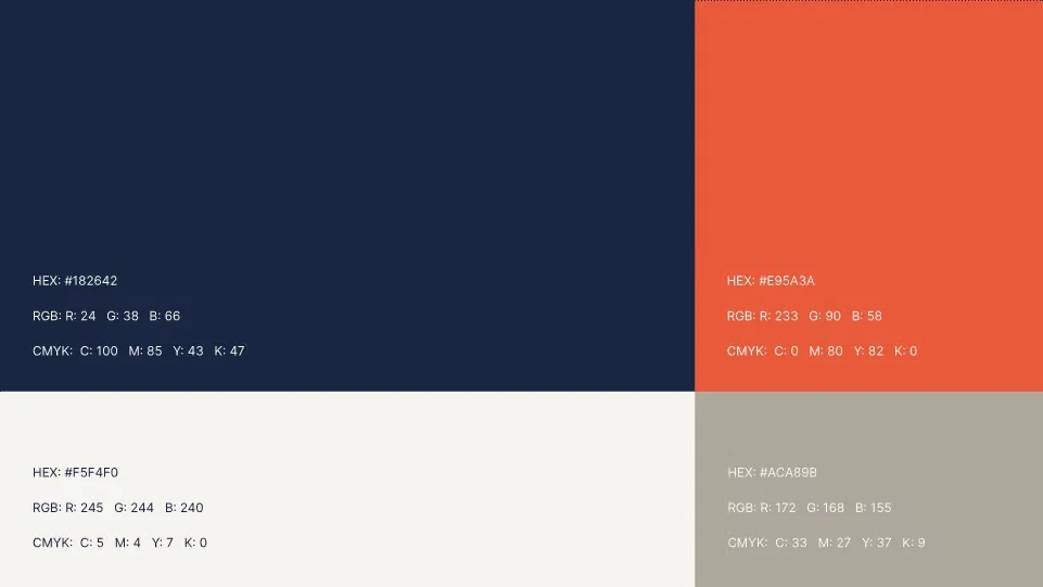
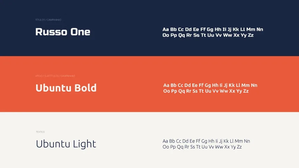
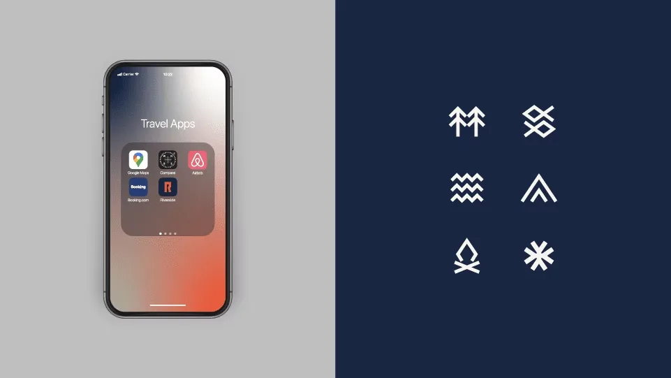
SistemaSystemcores, tipografia e gridcolour, type and grid
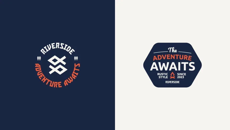
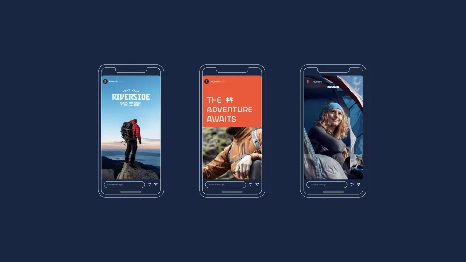
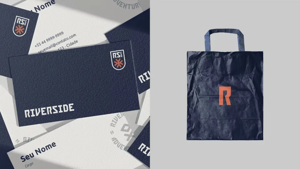
AplicaçõesAppliedpapelaria, digital e sinalizaçãostationery, digital and signage
A letra R traz em seus traços a silhueta de um punho. O gesto que fazemos ao celebrar uma conquista. The letter R carries in its strokes the silhouette of a fist. The gesture we make when celebrating a win.
Pronto pra começar?Ready to start?