Case studyCase study
Duo Garage
Automotivo · Identidade VisualAutomotive · Visual Identity
O desafioThe challenge
Construir uma marca de garagem com força e presença, sem recorrer ao clichê do setor, cromados, velocidade e agressividade.Building a garage brand with strength and presence, without falling back on the sector’s clichés, chrome, speed and aggression.
A soluçãoThe solution
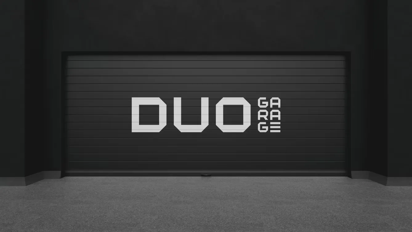
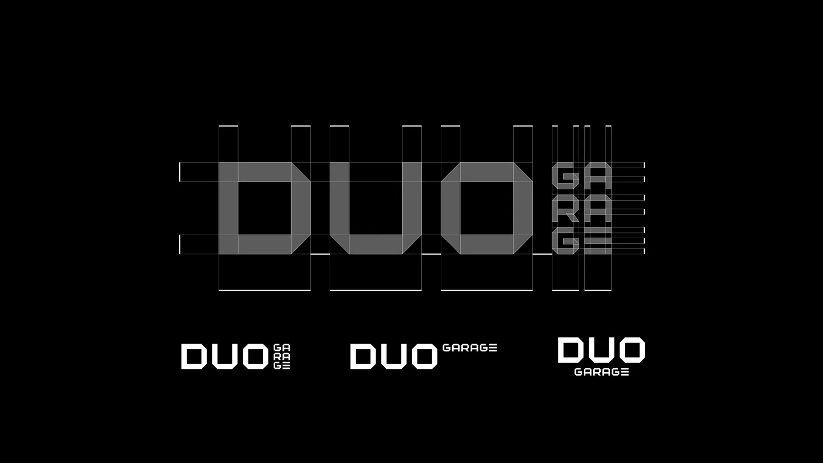
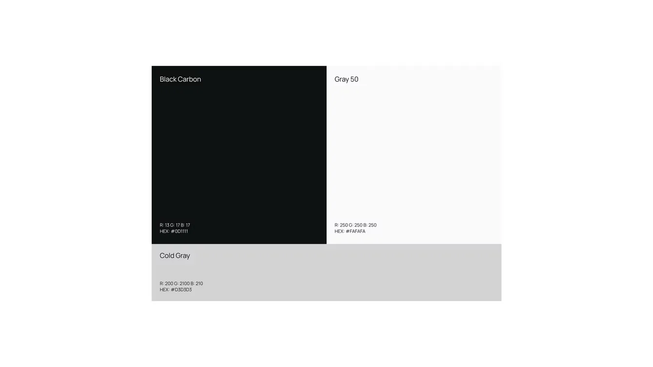
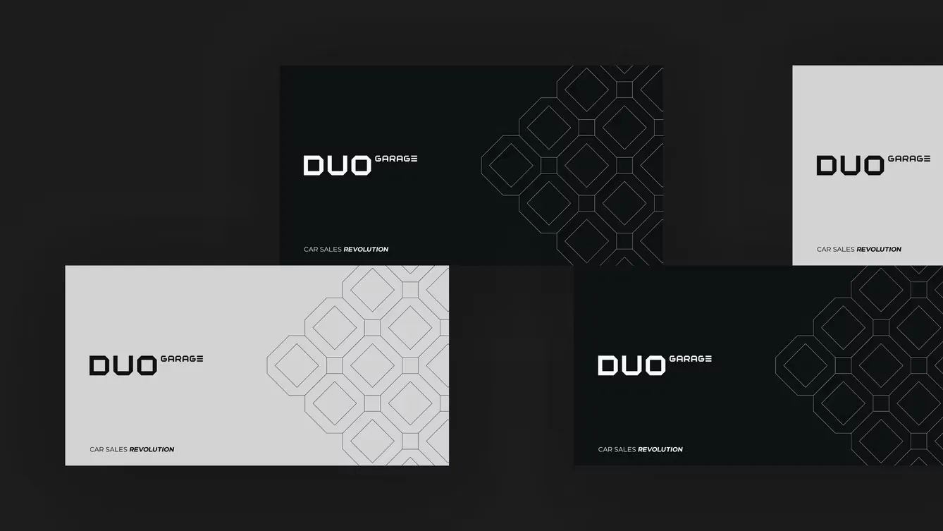
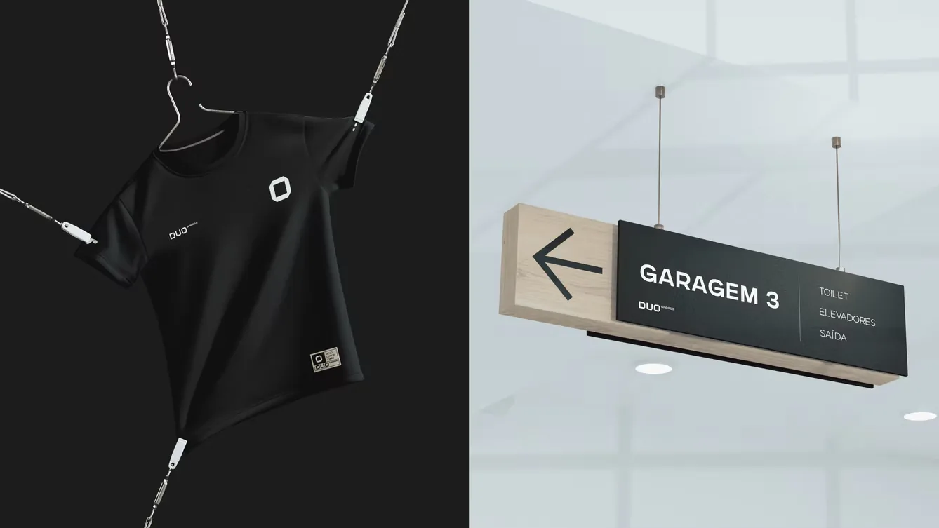
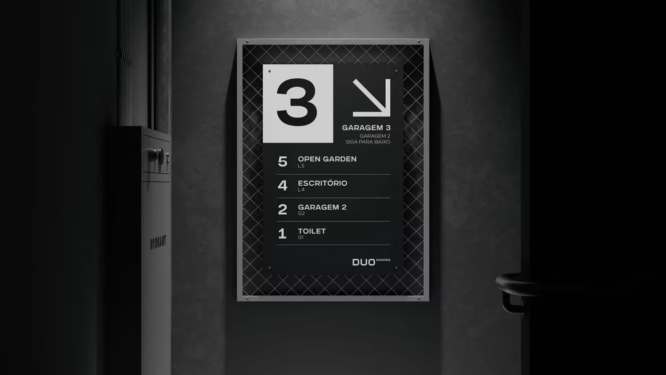
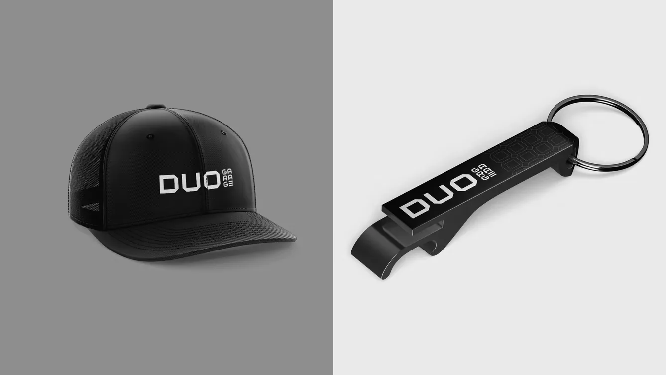
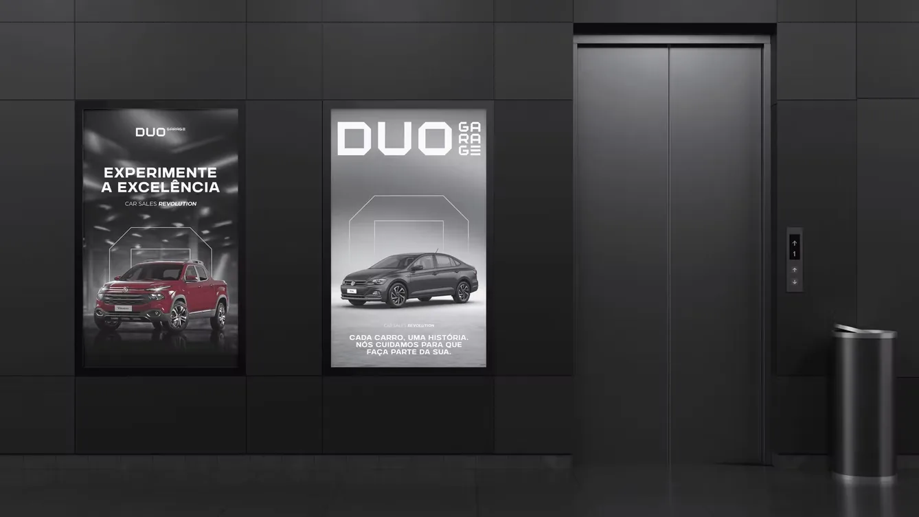
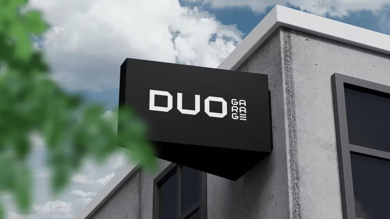
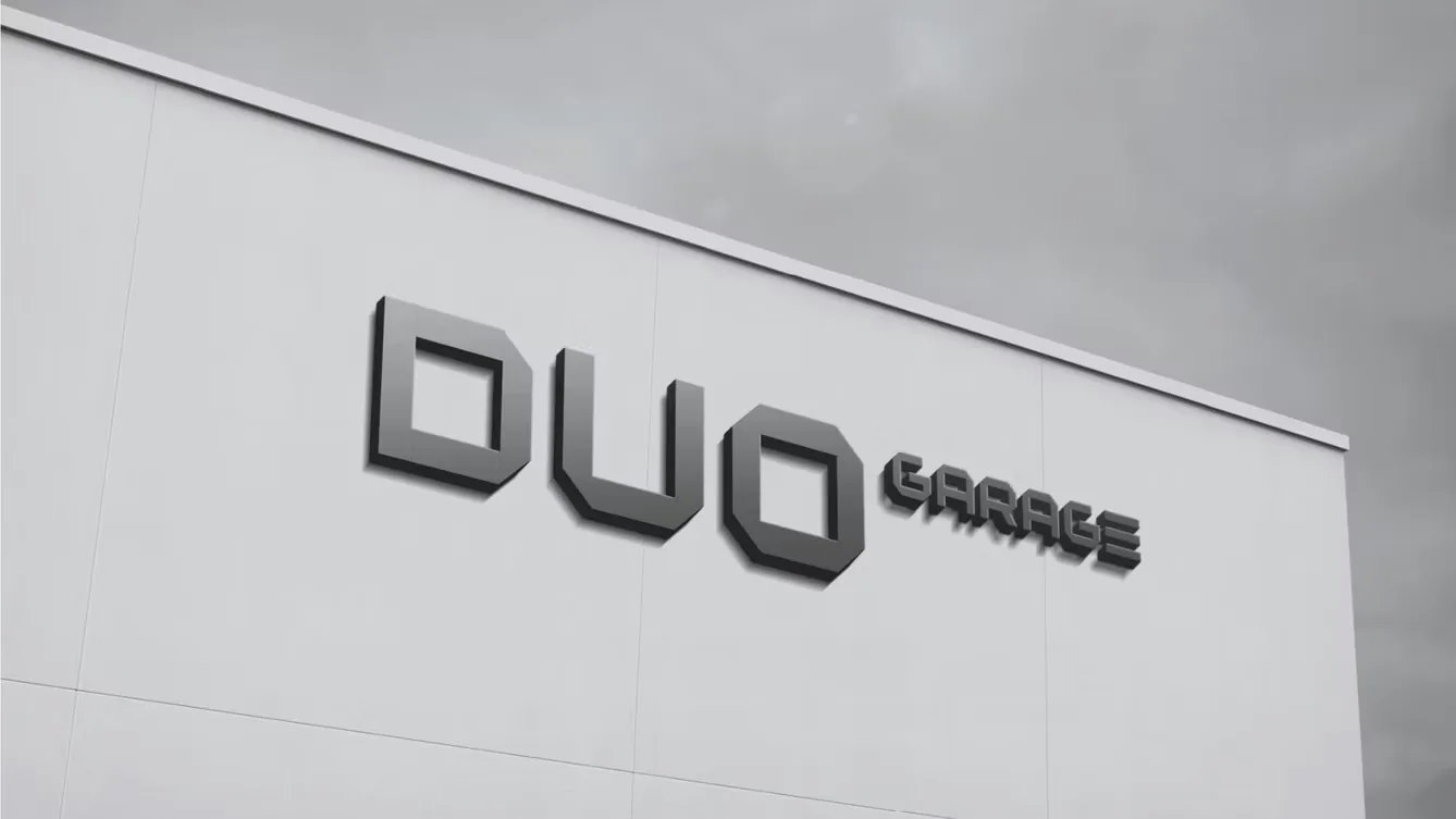
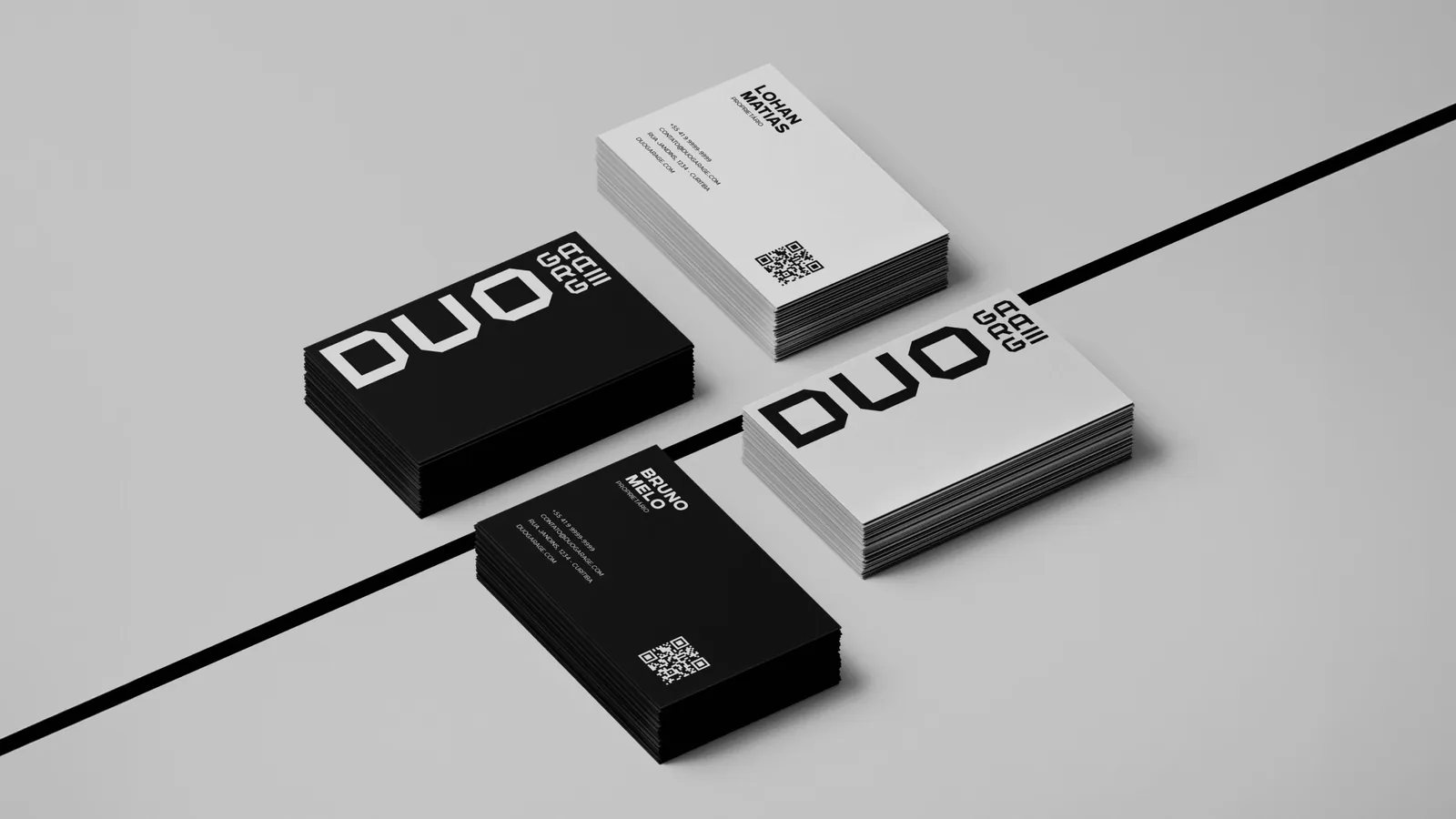
Identidade minimalista em preto e branco, apoiada no cinza para ganhar elegância. O símbolo circular admite várias leituras: volante, porca, roda. E o "E" de Garage é sutilmente estilizado para lembrar as portas de metal das garagens.A minimalist identity in black and white, with grey adding elegance. The circular symbol reads several ways: steering wheel, nut, wheel. And the "E" in Garage is subtly styled after metal garage doors.

Escopo do projetoProject scope
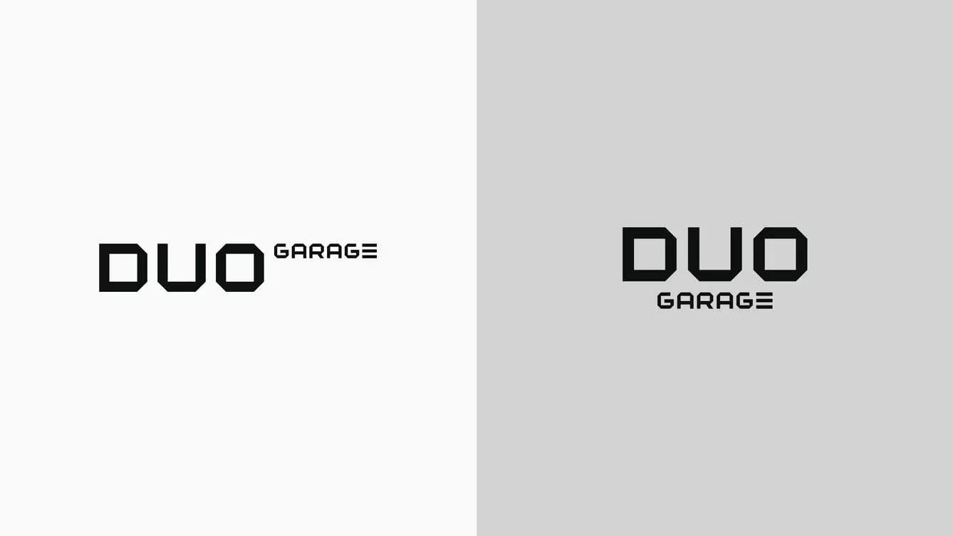
MarcaBrandlogotipo, símbolo e versõeslogotype, symbol and versions
SistemaSystemcores, tipografia e gridcolour, type and grid
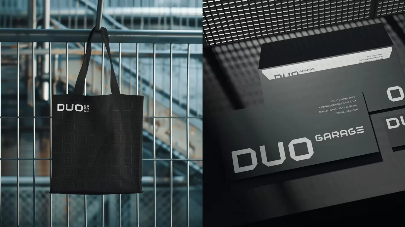
AplicaçõesAppliedpapelaria, digital e sinalizaçãostationery, digital and signage
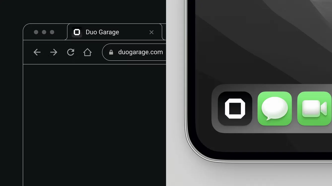
O símbolo circular evoca várias interpretações (volante, porca, roda), uma camada de versatilidade dentro de uma marca minimalista. The circular symbol evokes several readings (steering wheel, nut, wheel), adding a layer of versatility inside a minimalist brand.
Pronto pra começar?Ready to start?