Sabores de Curitiba
Gastronomia · Identidade VisualFood & Drink · Visual Identity
O desafioThe challenge
Traduzir em uma só identidade a diversidade gastronômica de Curitiba, bares, restaurantes e centros gastronômicos com públicos, preços e linguagens muito diferentes entre si.Translating the whole culinary diversity of Curitiba into a single identity, bars, restaurants and food halls with very different audiences, price points and languages.
A soluçãoThe solution
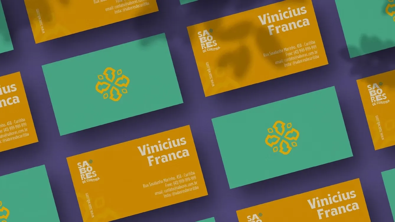
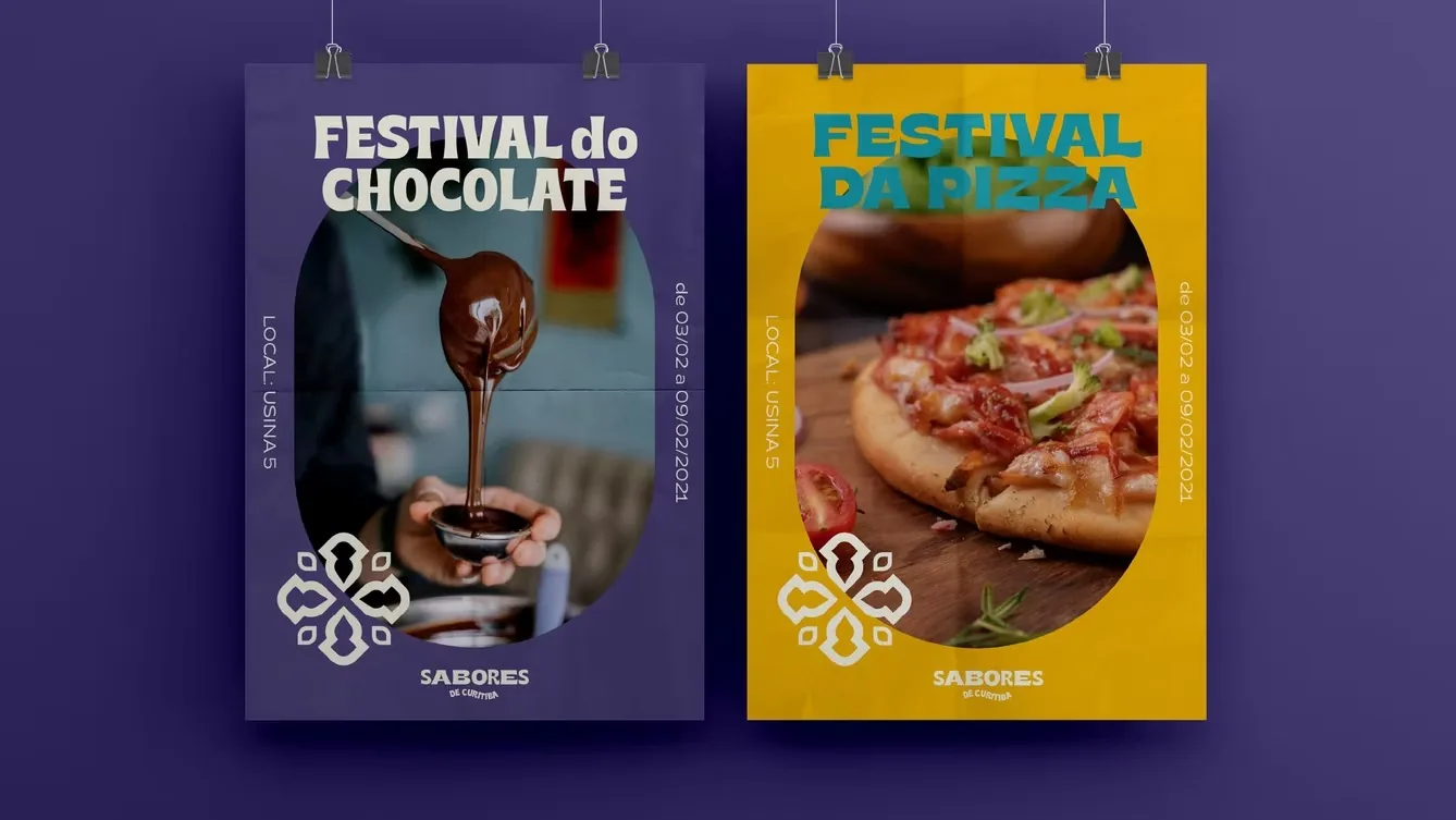
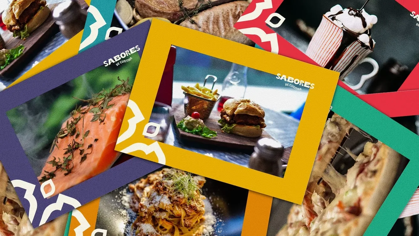
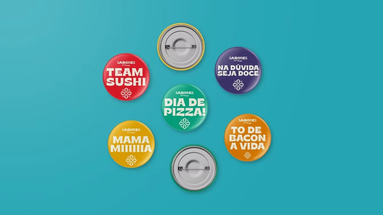
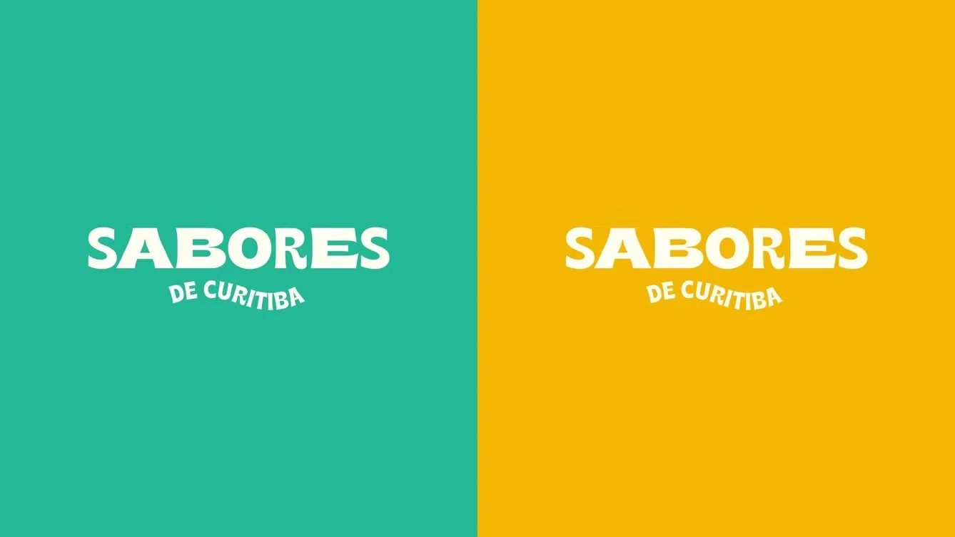
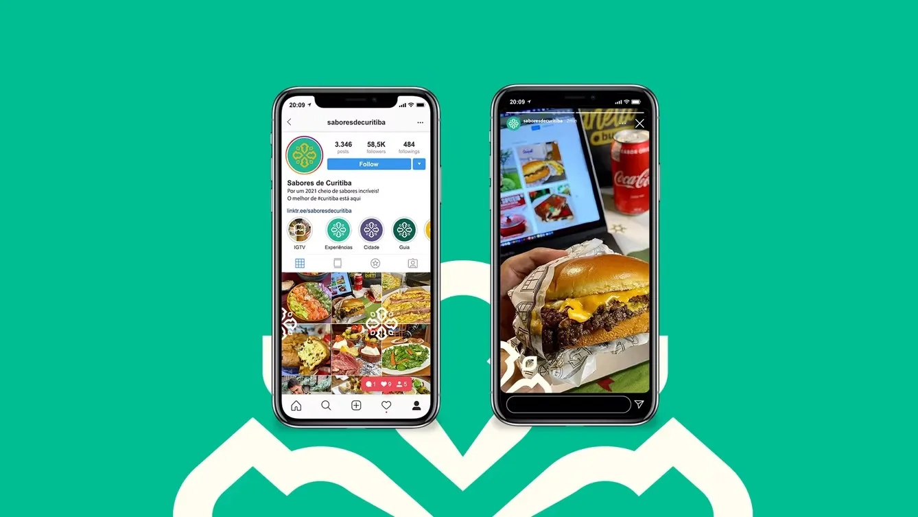
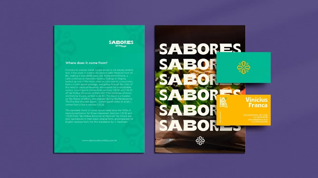
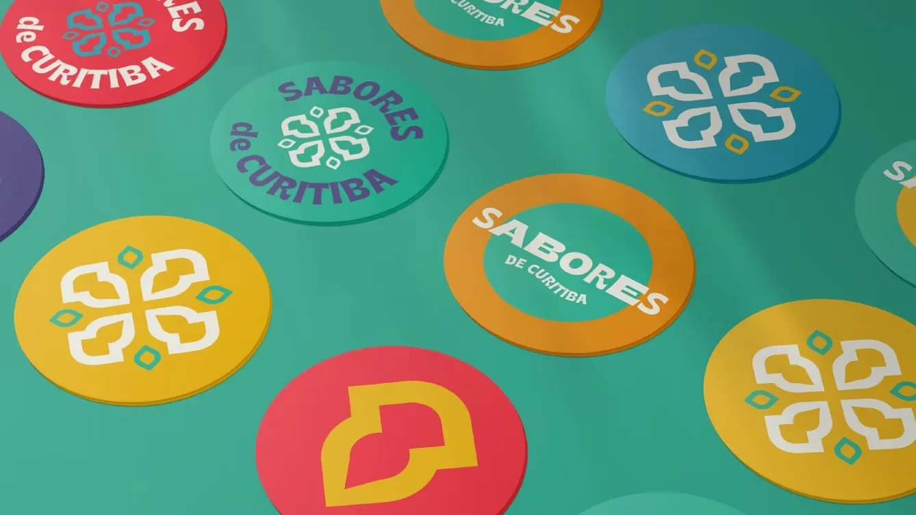
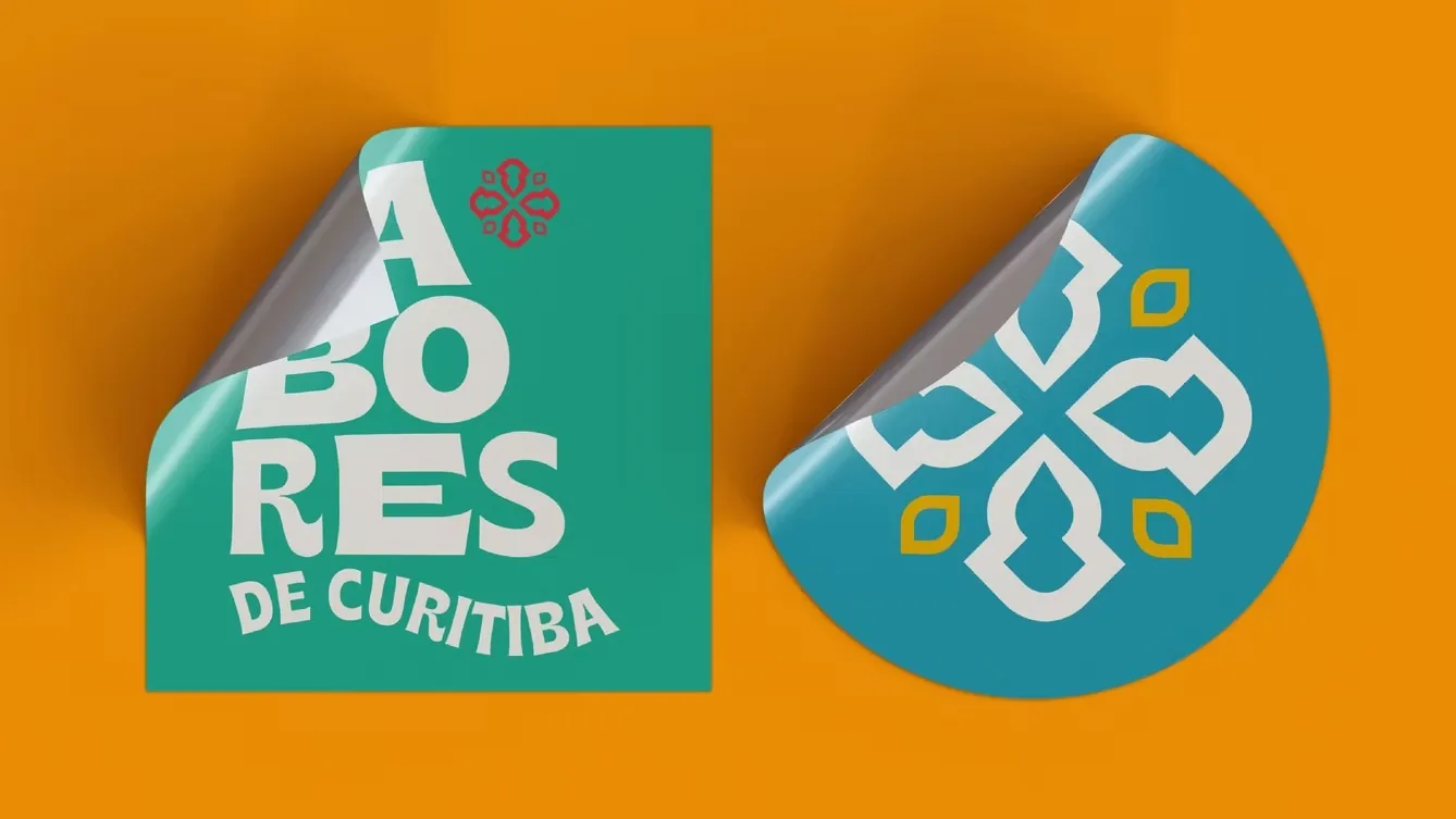
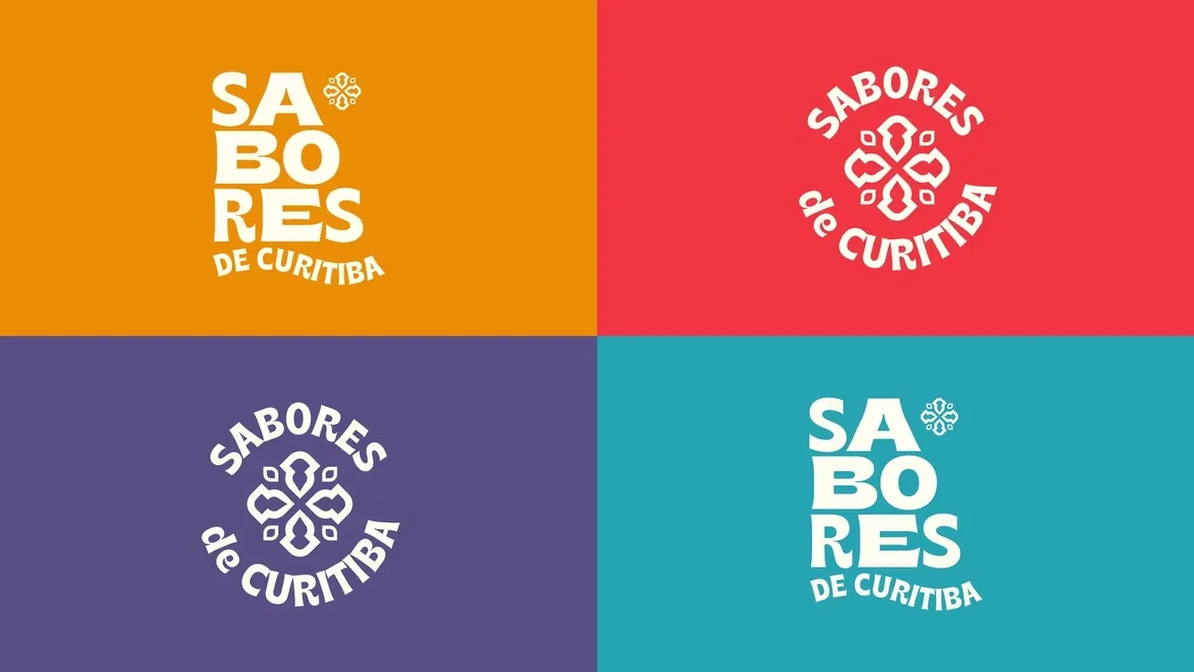
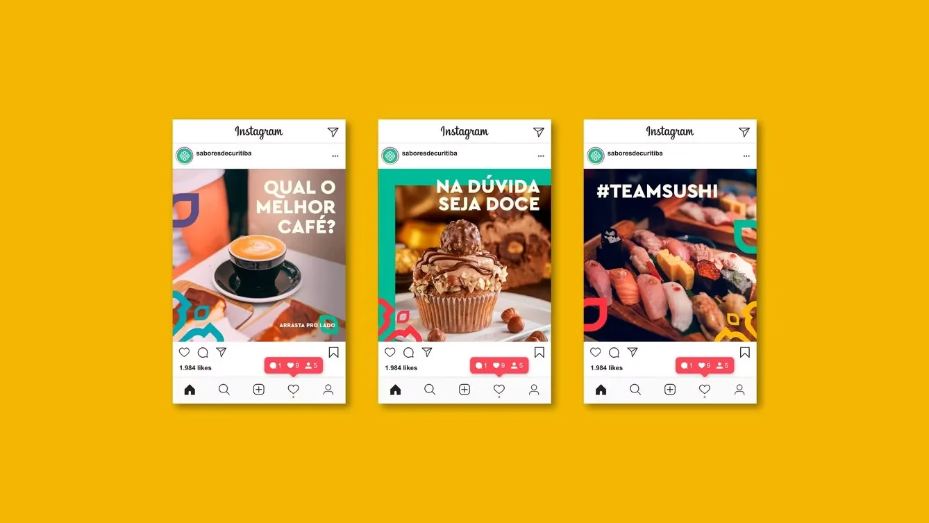
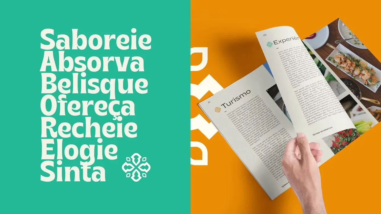
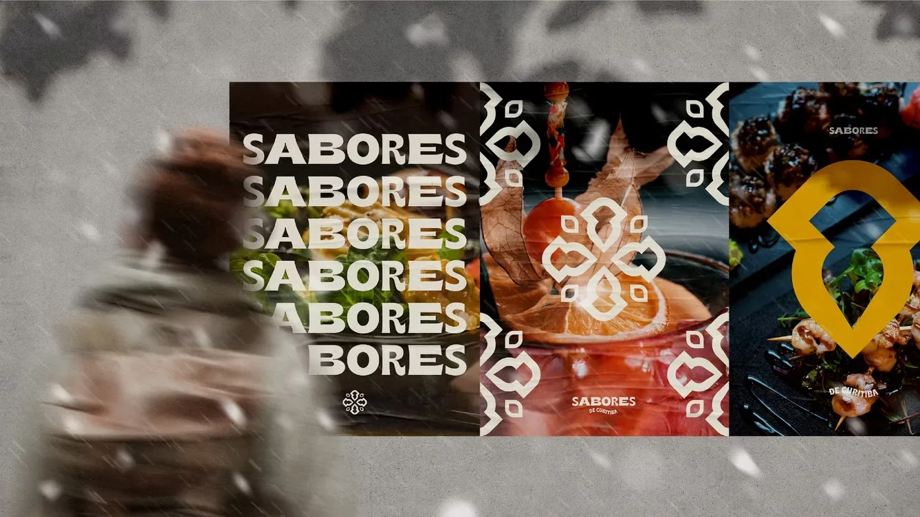
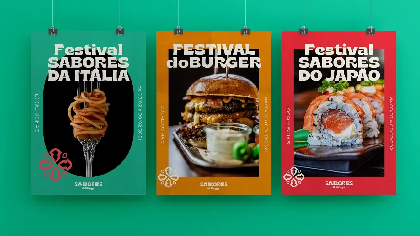
O logotipo cresce em ondas, dando movimento ao design e sugerindo as sinapses despertadas por cada refeição. Os tamanhos variados da tipografia simbolizam a diversidade dos estabelecimentos. O ícone é a representação minimalista do Petit-Pavé, mosaico histórico da cidade, que também gera os patterns da marca.The logotype grows in waves, giving the design movement and evoking the synapses each meal awakens. Varied type sizes stand for the diversity of the venues. The icon is a minimalist take on the Petit-Pavé, the city’s historic mosaic, which also generates the brand patterns.


Escopo do projetoProject scope
O formato crescente das letras dá movimento ao design, de maneira ondular, levando a ideia de sinapses propagadas através dos sentidos aguçados por cada refeição. The growing letterforms give the design an undulating movement, carrying the idea of synapses fired by the senses that each meal sharpens.